How to show legend in plots with plotly express?


Plotly Express is a new high-level Python visualization library:it's a built-in part of the plotly library and is the recommended staring point for creating most common figures. It is a easy-to-use,high-level interface to Plotly, which operates on a variety of types of data and produce easy-to-style figures.Using this library, one can make richly interactive plots in just a single function call. Here, I will be demonstrating various ways to deal with legends of a plot with plotly express.
Default Legend
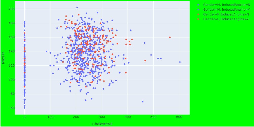
The legend title is automatically set, and the names can be overrided with the labels keyword argument.
import plotly.express as px
import pandas as pd

df_heart= pd.read_csv('./content/heart.csv')

fig_heart = px.scatter(df_heart, x ="Cholesterol",y="MaxHR",
                       color= "Sex",symbol="ExerciseAngina",
                       labels={"Sex":"Gender","ExerciseAngina":"InducedAngina"})
#shows the image
fig_heart.show()
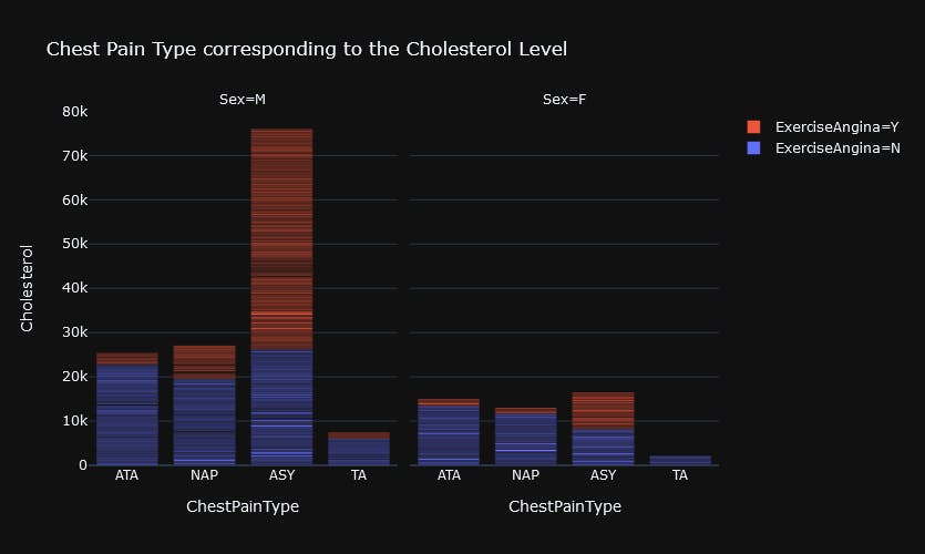
Legend Order
Plotly Express function includes a category_orders keyword argument which can be used to control the order in which categorical axes are drawn, but beyond that can also control the order in which legend items appear, and the order in which facets are laid out.
fig_heart = px.bar(df_heart, x ="ChestPainType",y="Cholesterol",color= "ExerciseAngina",
                       facet_col="Sex",template="plotly_dark",
                       category_orders={"ChestPainType":['ATA', 'NAP', 'ASY', 'TA'],
                                        "AnginaPresent":["Y","N"],
                                        "sex":["M","F"]
                       }
                   ,title="Chest Pain Type corresponding to the Cholesterol Level"
                   )

## legend_traceorder="reversed" results in the legend and stacks to match
fig_heart.update_layout(width=835,height=500,legend_traceorder="reversed")
fig_heart.show()
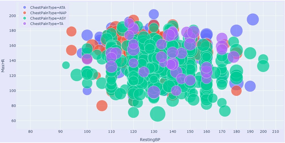
Legend Positioning
Legends have an anchor point, which can be set at a position of legend within the frame using layout.legend.xanchor and layout.legend.yanchor. Position of these anchors can be altered with layout.legend.x and layout.legend.y
fig_heart = px.scatter(df_heart, x ="RestingBP",y="MaxHR",color= "ChestPainType",
                       size="Cholesterol",size_max=45,log_x=True)
fig_heart.update_layout(legend=dict(
    yanchor="top",
    y=0.99,
    xanchor="left",
    x=0.01
))
# Altering the size and background of the frame
fig_heart.update_layout(width=1000,height=500,margin=dict(l=5, r=5, t=5, b=5),paper_bgcolor="Lavender")
# showing the image
fig_heart.show()
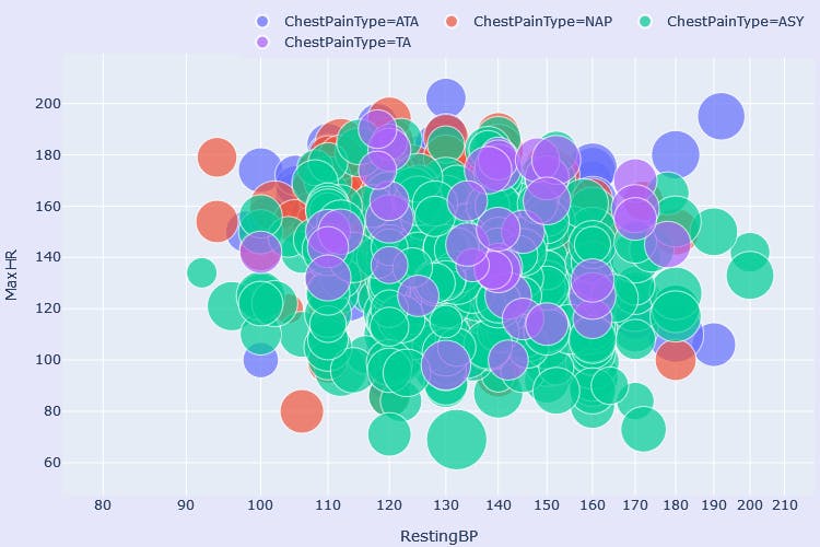
Horizontal Positioning
Adding orientation="h" to legend dict can result a horizontal legend.
#anchoring the legends
fig_heart.update_layout(legend=dict(
    orientation="h",
    yanchor="bottom",
    y=0.99,
    xanchor="right",
    x=1
))
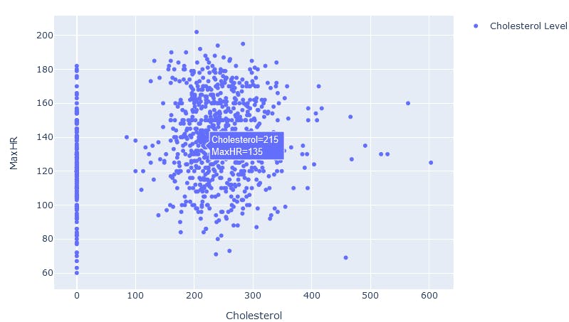
Setting 'showlegend' attribute
Set fig.data.showlegend or fig['data']['showlegend'] to True to add legend for a plot. Here, fig.data is a dictionary with various properties which can be altered according to the need
fig_heart = px.scatter(df_heart, x="Cholesterol", y="MaxHR")
fig_heart['data'][0]['showlegend']=True         # Adding legend for Scatter plots
fig_heart['data'][0]['name']='Cholesterol Level'
fig_heart.show()
Conclusion
Here, we learned how to effectively set,alter position,alter order of legends in plots with plotly express.
It is my first post in this platform. Feel free to give valuable comments and advice. Those will be really helpful🙂🙂